 There are many so-called ‘sayings’ that enrage me. Those irritating platitudes that people trot out in place of actually saying something intelligent or thinking before they speak. “Less is more” is one of them. Try saying that to a recent amputee, then count your teeth.
One of the main ‘sayings’ that raises my blood pressure faster than a thermometer in a fire daemon’s butt is: “You can’t judge a book by its cover.” I know that it’s a metaphor for not judging people based solely on their appearance, but frankly it’s one of the worst metaphors ever conceived. It’s akin to a judge telling a jury not to determine the guilt of the accused based on the evidence they’ve seen, or a politician telling you not to re-elect him based on his record in office (though I know that’s the basis of most political campaigns).
So, considering the huge percentage of their sales budgets that publishers spend on book covers, I wonder just exactly what we’re supposed to base our book purchases on? How long the book can float in a vat of sulphuric acid perhaps? How absorbent its pages are when used to mop the floor of an abattoir? Or maybe how effective it is in beating to death someone who’s just noted that “too many cooks spoil the broth”?
Got it covered
Yes, it’s okay, I’ve stopped venting now. You can come out from behind the sofa. Just don’t tell me that “if you can’t say something nice, don’t say anything at all”, because if that was the case, then I wouldn’t have a career, okay?
It should be pretty obvious by now that I’m going to be talking about horror comic covers in this month’s column. It should also be noted that Simon Marshall-Jones has already covered the theme of horror covers in his excellent Re(a)d Letter Day column. However, I’m a funny book writer and the fact that someone else has already had an idea has never stopped us using it ourselves. Just watch the ‘Architects of Fear’ episode of the Outer Limits and ask Alan Moore about the ending of The Watchmen if you don’t believe me.
Horror comics do it better
As is usually the case in these columns, I’m going to fix on a particular feature of the horror medium and claim that nowhere is it done better than in horror comics. In the case of horror covers this claim has never been easier to make.
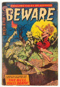
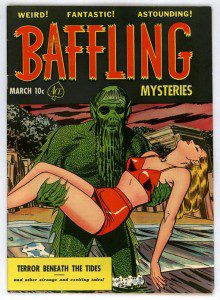
The horror genre had been around for quite a while by the time comics started to get in on the act. When it came to covers, the first few horror comics tended to copy their big brothers the pulps (such as Weird Tales), gothic novels and film posters. With the arrival of EC’s line of horror comics this all changed. Publisher William M. Gaines soon put together a roster of artistic talent that remains unparalleled to this day. Artists like Jack Davis, Al Feldstein, Wally Wood and Johnny Craig innovated to such a degree that cover artists for novels, pulps and film posters started to follow their lead. That influence has continued down through the years on many horror comics and short story anthologies, not to mention film posters like Creepshow, The Return of the Living Dead and last year’s Chillerama.
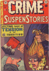
 In fact the sheer visceral impact of EC’s covers was one of the reasons that Gaines was called to appear in front of Senator Kefauver’s Judiciary committee in 1954. Kefauver held up the cover of Crime Supenstories 22, showing a man holding an axe and the severed head of his wife and asked Gaines if he thought it was in good taste. Gaines famously replied that it would only have been in bad taste if he’d shown the blood dripping from the woman’s neck and spilling from her corpse.
While this may seem like a glib remark, it’s worth noting that Gaines was in earnest. (He was also on a come down from the amphetamine pills his doctor had prescribed to help with his weight.) Early on that year Gaines had asked Johnny Craig to redraw the cover in question to hide the bloody neck. Nonetheless, the remark had the same effect on EC comics as the axe in the man’s hand had on his wife’s plans for the future. It killed them dead.
Jim Warren – leader of the horror comic renaissance
The next great renaissance in horror comic covers came in the mid to late 60s with the launch of Warren’s Creepy, Eerie and Vampirella magazines. Publisher Jim Warren’s big innovation was to use fully painted covers, utilising classic horror iconography in ways that were both dynamic and totally fresh. This was hugely influential on the comic and magazine market, single handedly launching the black and white comics publishing trend of the 60s, 70s and 80s. Warren also showcased the work of artists who would go on to have a huge impact on the world of film and film poster art like H R Giger, Frank Frazetta and Boris Valejo. Once again horror comics were leading the field and setting the agenda with their covers.
The next big innovation comes with the rise of mature and creator owned titles. Taking their lead from smaller independent publishers like Pacific Comics and Eclipse, Marvel and DC founded the Epic and the Vertigo imprints in the 80s to highlight the work of writers and artists who were making good use of their greater creative freedom. The change in approach to subject matter brought a change in approach to the covers. Artists like Bill Sienkewicz, Jon J Muth, Scott Hampton and Dave McKean brought a fine art sensibility to the horror comic cover and changed it irrevocably. McKean’s influence on the horror covers and poster art cannot be understated. There were few horror/dark fantasy/urban fantasy novels or anthologies released in the 90s and 00s whose covers didn’t make a direct reference to McKean’s style. Proving that horror comic covers were still the most influential in the medium.
Celebrated and forgotten masters of horror comics
I must apologise that this whistle-stop history covers so few of the really great horror comic covers. If you’d like to see some more excellent and arresting covers please check out the link to the pre-comics code covers of the 50s, while there are some real gems over here at the theatre of terror. I’ve also missed out some of my favourite artists such as Basil Wolverton who took the grotesque to new plateaus of brilliance in the 40s and 50s. Not to mention Don Heck, who is mostly known these days as the silver age Marvel artist who wasn’t quite as good as Jack Kirby or Steve Ditko. This is pretty much how I thought of him until I saw his brilliantly unsettling covers from the 50s and realised he was wasted on super hero comics. It is an unbelievable injustice that Howard Nostrand is all but forgotten today, because his covers and interior art rival anything that has ever been done in horror comics. Finally you really have to check out Tom Sutton too, his covers for Warren comics are classics but his Charlton Comics covers are as deeply unsettling as they are strangely psychedelic.
Why are horror comic covers so important?
 Like any type of entertainment that appeals to our baser instincts, the anticipation of the cheap thrills to be had is always more important than the actual pay off. This is why horror comic covers have had such an impact. Like the barker outside a freakshow or the ticket tout outside a strip joint, a horror comic cover makes outlandish claims about the dreadful delights to be found within its covers. It’s principal job is to titillate and tantalise and part you from your cold hard cash. What you find inside the comics is rarely as exciting as what was on the cover, but the cover alone is often worth the price of entry.
While horror comics have often been a labour of love for the creators (albeit a twisted sort of obsessive love), for the publisher they’ve primarily been a commercial concern and this means they’ve had to stand out from all the other comics and magazines on the shelves. For this reason the publishers have always been willing to let their cover artists push the boundaries that little bit further, to challenge more taboos and to test the possibilities for graphic layout and design.
This extra freedom has often led to a massive failure of taste or artistic achievement, but it has also been responsible for some of the most arresting and exciting visual images in the history of the comics medium. That is why I think, when it comes to horror, comics have always had the best covers.
JASPER BARK
If you enjoyed Jasper Bark’s column, please consider clicking through to our Amazon Affiliate links and buying some of his fiction. If you do you’ll help keep the This Is Horror ship afloat with some very welcome remuneration.


1 comment
Jasper, I like the cut of your jib. Excellent column and I agree with everything you’ve stated 100%. Thanks for giving the marvelously “lurid” comic covers a nice spotlight of attention. And I especially enjoyed your opening statement.
You had me at “raises my blood pressure faster than a thermometer in a fire daemon’s butt” or was it “the paradox of cliches”? What ever the case, two thumbs up!